A step-by-step guide
What is Colour Temperature?
Colour temperature is a fundamental factor when selecting a light source, together with the Colour Rendering Index (CRI), light output and wattage. It’s often referred to as CCT (short version of Correlated Colour Temperature) and it’s measured in Kelvin degrees (K), so it measures a temperature.
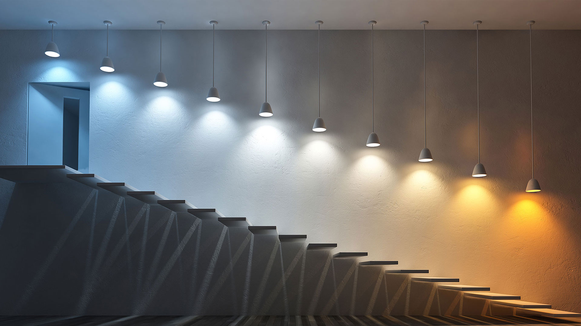
So, what has temperature to do with lighting? Well, colour temperature has to do with the colour appearance of a white light source. Light sources that appear warmer and yellowish have a low colour temperature (2000K-3500K) while light sources that appear colder and more bluish have a high colour temperature (5000K-6500K).
Not sure what this means yet? Just think about the restaurant you’d like to take your date to – the one with the most romantic atmosphere you know. That feeling of warmth, comfort and cosiness you love has to do with colour temperature. Or that feeling of concentration and energy when you’re standing in a bright office, maybe with daylighting too? That has to do with colour temperature as well.
 Haz Restaurant (left) / Berghaus Head Office (right)
To better understand what colour temperature is and how to measure it, here’s a (hopefully brief!) scientific definition. Colour temperature is linked with the spectrum and chromaticity of a light source. Each light source has its own spectrum i.e. the amount of light emitted by the light source at each wavelength. Light sources with a low colour temperature have a spectrum with prevalent high wavelengths (closer to the infrared area), giving light a reddish appearance – like candlelight. That’s the ideal colour temperature for our homes or the aforementioned restaurant, to create a relaxed and cosy atmosphere. Light sources with a high colour temperature have a spectrum with prevalent low wavelengths (closer to the UV area), emitting a more bluish and cold light – like daylight. That’s the right lighting for offices, gyms or schools – all spaces where we need more dynamicity and focus.
The spectrum of a light source can be described by chromaticity coordinates, which represent the tone and hue of that light source. The official scientific definition of colour temperature states that “Colour temperature is the temperature of an ideal object, called black body, having the chromaticity nearest to the chromaticity associated with the spectrum of the light source.” [1]. For this reason, the colour temperature is conventionally stated in the unit of absolute temperature, the Kelvin (K). The chromaticity coordinates can be plotted in the chromaticity diagram, where we can see the tone and hue of the light source. If the source is white, the point lands on the so-called Planckian locus, the curve which represents all the colour temperature values of the ideal black body. This diagram can represent whatever white light source and shows both the chromaticity coordinates of the source and its colour temperature.

Most common warm light sources generally have a colour temperature between 2200K-3000K, neutral light sources around 4000K, and cold light sources between 5000K-6500K.
Here are a few colour temperature examples that anybody can relate to: candlelight is around 1800K, a typical incandescent bulb is 2700K, while a typical fluorescent lamp is 4000K-5000K. When we talk about natural lighting, there isn’t a fixed colour temperature to refer to. It can be approximately 2800K at sunset, 5600K at noon with a clear sky, 6500K with an overcast sky or 4100K with moonlighting.

What is the importance of Colour Temperature for lighting designer?
Choosing the right colour temperature is crucial for a lighting designer when creating the perfect atmosphere and mood in a space, depending on what people are required to do in that space. We wouldn’t want a warm and soft atmosphere in a classroom, where students need to stay focused and alert. Yet we would want a comfortable and peaceful mood in a spa, where people want to rest and relax.
Using warm or cold lighting has a huge impact on the perception of a space and the atmosphere and mood we intend to create, and it’s a factor that must be carefully considered along with lighting levels, colour rendering and directionality of lighting. You can see in the image below how a different colour temperature completely changes the perception of the room: in which would you rather rest after a long day? There’s not a completely “right” answer to this question, since preference on colour temperature is very subjective.

However, here are some simple/ general design rules:
– Warmer lighting (2700K-3000K) for relaxing spaces – such as a restaurant, a hotel lounge or a bedroom.
– More neutral lighting (3000K-4000K) for spaces where people need to better discern colours and textures of products – such as retail projects or museums.
– Colder lighting (4000K-5000K) for spaces where people need to maintain focus and stay alert – such as schools, gyms or hospitals.
What is the difference between Colour Temperature and Colour Rendering?
When designing a space, colour rendering is another factor to consider along with colour temperature. But what’s the difference between the two? Whilst the colour temperature tells us information about the colour of the light, the Colour Rendering Index (CRI) tells us how accurately a light source can render colours (read our blog post about CRI here). The two factors give us different information about the light source, but they’re strictly connected when designing a space, especially if a design goal is to enhance the colours and materials of objects and furniture. A high CRI (>90) is recommended to allow people to properly discern colours, but a different colour temperature can be selected depending on the colours and the materials we want to highlight.
To highlight and enhance warmer tones, such as bronze, wood or gold finishes, it’s better to use warmer lighting, whilst blue, green or silver finishes would be better enhanced by colder lighting. It’s important to keep in mind though that the further away we move from neutral lighting (3000K-4000K), the poorer the CRI. For example, a very warm light fitting like a low-pressure sodium lamp, will completely distort our colour perception, making everything yellowish. Not ideal for let’s say a shopping mall or a museum (unless you’re Olafur Eliasson – he designed a few yellow rooms at the National Gallery in 2017 and it was pretty cool! [2]).

Why do light sources with the same Colour Temperature appear different?
Contrary to what one might think, colour temperature is not an entirely precise measurement of the colour appearance of the light and that’s the reason why light sources with the same colour temperature can appear different. To explain this, we need to go back to science (sorry!).
As explained before, colour temperature is defined by the chromaticity of the black body, which is only a reference ideal light source. It’s pretty rare that two real light sources with the same declared colour temperature have exactly the same chromaticity and the magnitude of this discrepancy determines whether there’s a noticeable colour difference in two light sources. To establish whether it’s possible to detect the colour difference, a series of concentric ellipses – called MacAdam ellipses – can be plotted in the chromaticity diagram for each colour temperature: all the chromaticity inside the same ellipse represent light sources that we perceive having the same colour.

This is particularly important since the introduction of LEDs. Multiple LEDs can be assembled to create one light fitting (just think about a typical LED strip installed under a kitchen cabinet) and a detectable colour difference between the LED chips would lead to a very poor lighting effect. For this reason, manufacturers produce a series of LED chips operating within the same MacAdam ellipse, so that there will be no discernible difference in colour. Typically, good LED chips are produced within two or three MacAdam ellipse steps: the colour difference would be so minor that our eyes wouldn’t be able to perceive it and the colour of the light emitted by the fitting would appear uniform.
 Image source (left) Image source (right)
What does Colour Temperature have to do with Human Centric Lighting?
Human Centric Lighting is the concept describing the connection between lighting and wellbeing, and it’s based on the mechanism of our circadian rhythm. The circadian rhythm is a sort of “internal clock” that keeps our body synchronised with the natural cycle of day and night: it ensures a peak of alertness and energy during the day and allows us to get to sleep during the night. Since we spend so much time indoors, artificial lighting can help keep our internal clock correctly synchronised through the correct selection of colour temperature. In fact, our circadian system is more sensitive to cooler light which helps us stay alert and focused, while it is less sensitive to warmer light. Having a higher colour temperature during the day (4000-5000K) and lower colour temperature during the night (2600K-3000K) would artificially recreate the natural evolution of daylight from sunrise to sunset [3].
How can we use this information to design spaces for people’s wellbeing? Well this is where LEDs come in to help. A benefit of using LEDs is being able to change the colour temperature of white light sources and control it – creating the best scenario for each situation. Let’s think about an office where no daylight is available: the light fittings could have a high colour temperature and 100% dimming during the day to improve the employees’ performance at work; the lighting levels and the colour temperature could gradually decrease during the afternoon, to “prepare” their brains to go home, relax and go to sleep.

Conclusions
So, what are the factors a designer should keep in mind when selecting the colour temperature of light fittings?
1. The intended mood and the atmosphere of the space: Relaxed? Dynamic? Romantic? Apocalyptic? Your choice!
2. Finishes and materials that need to be enhanced.
3. Checking the MacAdam ellipse steps on luminaire specification sheets for colour consistency.
4. Keeping in mind that colour temperature significantly affects our circadian rhythm, mood and psychological wellbeing: always design for people!
Blog post by Francesca Feltrin
Share this post
References
[1] Schanda J., Colorimetry: Understanding the CIE system. Wiley & Sons, New York 2007
[2] Netflix Documentary “Abstract” – Episode 1 ”Olafur Eliasson: The Design of Art”
[3] Ladopoulos I.,Shaw K., “Lighting Design for Health, Wellbeing and Quality of Light. A Holistic Approach on Human Centric Lighting”, IALD European Regulatory Affairs Working Group, 2017