To light or not to light
Off the top of your head, you can probably think of a dozen buildings that are recognisable just from the silhouette. Londoners even have a penchant for nicknaming their skyscrapers based on their quirky shapes. But what is the unique characteristic of these buildings at night? It’s a more difficult image to conjure.
From this simple thought exercise, I believe, we have begun to design more unique façade lighting schemes so that an iconic form doesn’t fade away into the night. There is too much going on in London for neighbours to not notice the flocks of cranes and regeneration projects underway, and so a chain reaction of reconsideration has begun to take place. Even smaller, more subdued buildings have begun to revise the age old “if you flood light it, they will come” mentality.

Image, 60 Victoria Embankment: Structure Tone
You can walk along the bank of the Thames at night and actually see the evolution and breadth of current façade lighting design schemes. For me, the stand-outs could not be more different. 60 Victoria Embankment, though striking during the day, stands out against its unlit neighbours at night with beautifully controlled washes of light across its different decorative elements. The Sea Containers, just opposite, puts subtlety to the side with its loud, linear blue striplights and golden-yellow illuminated crown.

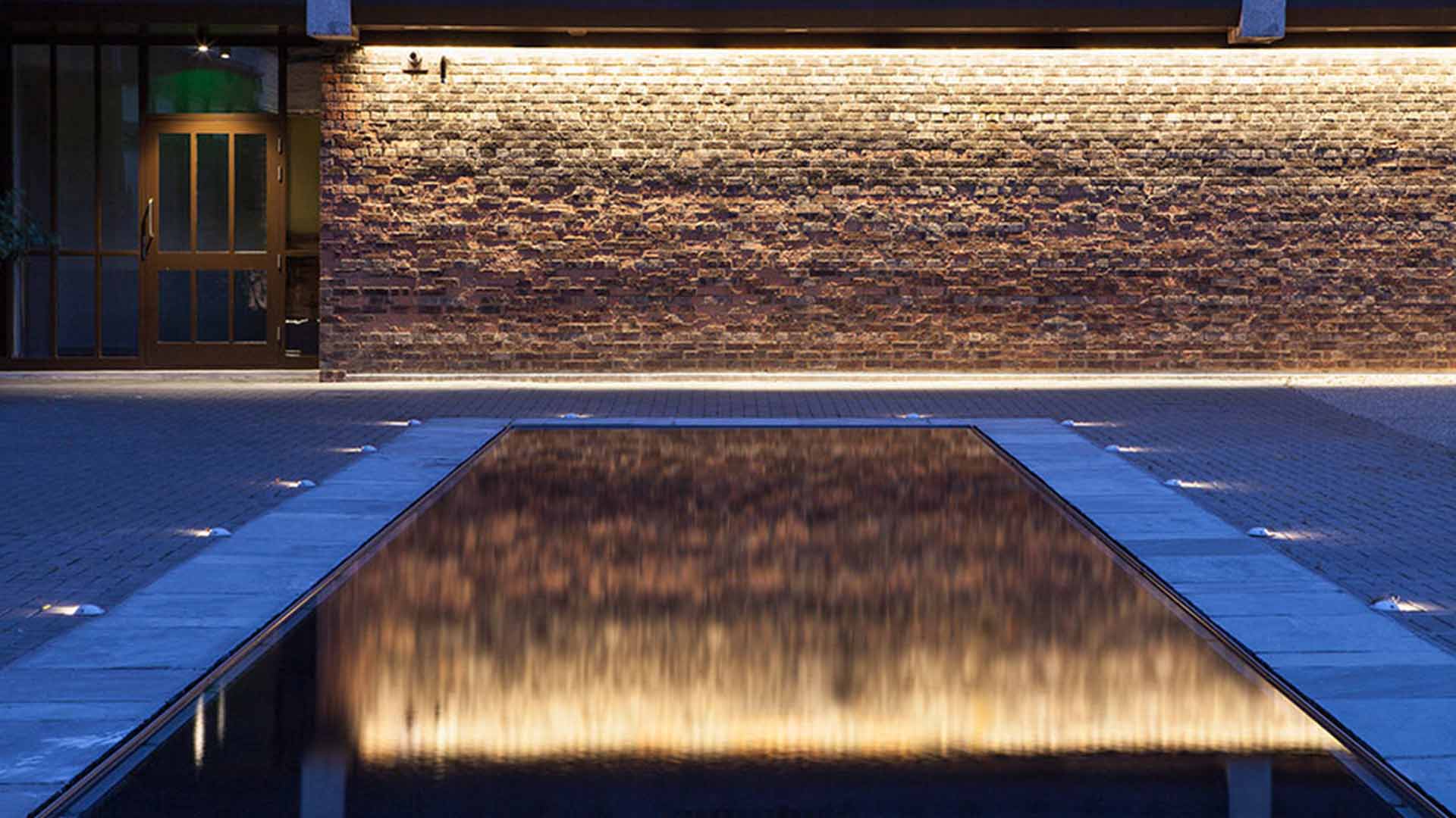
Image, Sea Containers Wharf: Nulty
However, this proliferation of good façade lighting design comes with a higher demand for it elsewhere. Not to name names, but there are some garish streets in Holborn and Mayfair that lose their charm because of a lack of thoughtfulness in the design. Though the following may seem like I am betraying my profession, I’m going to say it.
Not every building needs to be lit.
At a recent design workshop, we stressed that the two buildings in our scope should not have façade lighting because of their context. They are right in the centre of a block of mixed-use developments that are visible from both the Thames and a main artery for South Western Rail services. In looking at the almost incalculable number of vantage points into the site, we decided that it would be irresponsible to impose façade lighting on these structures.
This was met with some scrutiny (what do you mean that part of your scope is to not do anything), but after a thoughtful discussion about context, we agreed that a façade scheme would overwhelm the balance of the development as a whole. For me, balance is one of the most treasured aspects of design, or at the very least is omnipresent in the design process.
Sometimes, a considered decision leads you to stand back and respect what’s around you. Your building can be iconic without RGB spots and a million pound control system (which will, inevitably, lead to rainbow chases). It can be remembered without kilowatt spotlights blasting onto every inch of façade.
But sometimes it is important to bring out the beauty of an intricately detailed façade, or to make a statement with pattern and movement. We’re currently in the process of designing bespoke chandeliers to match the Victorian gas lamps that used to adorn an historic area. We’re also in the midst of revitalising a façade with concealed luminaires to create a dynamic, colourful, programmable-to-your-every-whim scheme to invigorate and refresh the development.
Your building can be beautiful with or without light. Just check with the neighbours first.
Blog post by Kael Gillam
Banner image: © James French